TL;DR: Mobile-first design means building your website for smartphones first, then scaling up for larger screens. With most users browsing on mobile devices and search engines prioritizing mobile-friendly sites, it’s essential for better usability, faster load times, stronger SEO, and higher conversions. Today, mobile isn’t secondary; it’s the main audience.
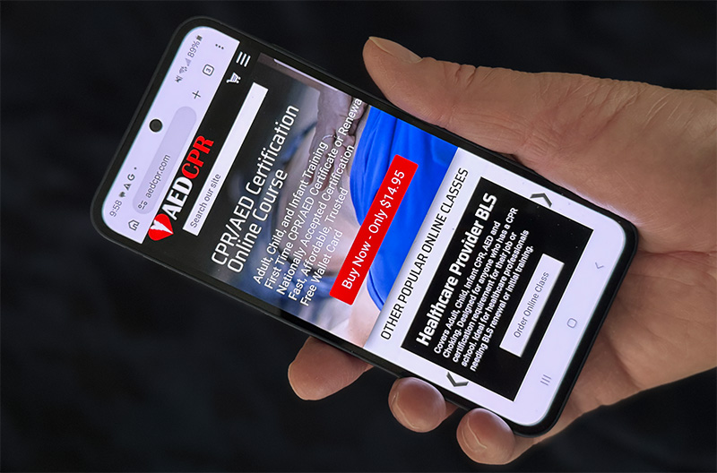
Over the last decade, the way people browse the internet … Read more “Mobile-First Design: Why It’s No Longer Optional”