TL;DR: Mobile-first design means building your website for smartphones first, then scaling up for larger screens. With most users browsing on mobile devices and search engines prioritizing mobile-friendly sites, it’s essential for better usability, faster load times, stronger SEO, and higher conversions. Today, mobile isn’t secondary; it’s the main audience.
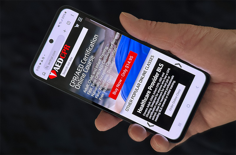
Over the last decade, the way people browse the internet has changed dramatically. Smartphones have become the primary device for searching, shopping, reading reviews, booking services, and interacting online. For many businesses, most website traffic now comes from mobile users, not desktop visitors.
Many websites are still designed with desktop screens in mind first, and then the desktop design is adapted for smaller devices. This approach no longer works.
Mobile-first web design is now one of the most important strategies in modern web development. It helps create faster, functional, and more user-friendly websites for the devices people use most.
If your website was not built for mobile users first, you may be losing traffic, leads, and sales without realizing it.
What Is Mobile-First Design?
Mobile-first design is a web development method where a website is structured and designed for mobile devices before the desktop version.
Traditionally, websites were developed for desktop screens. The content was then trimmed and reorganized to work on a mobile device. With a mobile-first design, developers begin with the smallest screen. They develop a page that is functional and attractive on a mobile device. Then they expand and adapt the layout for larger devices like tablets, laptops, and desktops.
Mobile-First design forces designers to prioritize what matters most on mobile devices:
- Clear navigation
- Fast loading speed
- Readable text
- Simple layouts
- Easy-to-tap buttons
- Essential content only
By starting with mobile design, websites often become more focused and effective across all devices.
Why Mobile-First Design Matters More Than Ever
1. Mobile Traffic Dominates the Web
For most industries, more than half of all website traffic comes from mobile devices. In some markets, that number is significantly higher.
Whether someone is shopping online, searching for information, or just killing time, there’s a good chance they’re doing it on a smartphone.
If your site performs poorly on mobile devices, users will be frustrated and less likely to sign up or complete a purchase. You may also be penalized by search engines.
2. Google Prioritizes Mobile Experience
Search engines like Google increasingly evaluate websites based on mobile user experience. If your site is slow, difficult to navigate, or broken on smaller screens, it can hurt visibility in search results.
Google often uses the mobile version of your website for ranking and evaluation. Google’s mobile-first indexing is designed to give mobile users the best experience possible.
An inadequate mobile site with poor UI and UX can affect both user experience and SEO performance.
3. Mobile Users Expect Speed and Simplicity
Mobile users are often on the go. They want answers quickly and have little patience for slow or cluttered websites.
If pages take too long to load or menus are difficult to use, many visitors leave immediately.
A mobile-first site focuses on delivering the most important content quickly and easily.
The Difference Between Responsive Design and Mobile-First Design
These two terms are related but not identical. Most mobile-first designed sites are also responsive. But the fact that a site is responsive does not make it more likely to be mobile-first.
Responsive Design
Responsive design simply means a website adapts to different screen sizes using flexible layouts. A good example is if you are on a laptop or desktop and need to resize the browser. The layout adjusts to the new size of the browser window. This is essential because the website needs to look good and function well on different screen resolutions or in different-sized windows. A “mobile-friendly” site will also adjust and perform well on a smaller mobile device.
Mobile-First Design
Mobile-first web design is a development method where the mobile experience is intentionally designed first before upscaling to larger devices.
Designing using mobile-first goes beyond being responsive.
Core Principles of Mobile-First Design
Prioritize Essential Content
On smaller screens, space is limited. Every element should have a specific purpose. Every headline, image, and button should be clear and defined. Avoid having too much on the screen at the same time. In our experience, users interact less and spend less time on a cluttered website. Key questions for mobile-first developers
- What does the user need first?
- What action do we want the user to take?
- What content is essential?
- What content can be simplified or removed?
Simplify Navigation
Difficult or clumsy menus frustrate users on mobile.
Best navigation practices include:
- Clear menu labels
- Compact navigation menus
- Sticky navigation (always visible, no need to scroll)
- Search functionality for larger sites
Users should easily find key pages quickly.
Design for Touch
Desktop users click with a mouse. Laptop users usually have a touchpad. Mobile users tap, pinch, or swipe with their fingers.
Best touch design practices:
- Sufficient spacing between clickable elements
- Buttons need to be large enough to be easily clicked
- Form elements need to be large enough to be easily selected
- Sticky elements should be at the top or bottom of the screen
- Make sure the user can scroll without clicking an element
Small clickable elements and clickable elements that are too close are some of the fastest ways to frustrate users.
Improve Readability
Be sure to use:
- Readable font sizes (16pt)
- Scalable fonts
- Strong contrast
- Short paragraphs
- Clear headings
- Enough spacing between elements
Good typography matters even more on smaller screens. Users should never need to zoom in to read content.
Optimize Speed
Mobile users may browse on slower networks or limited data connections.
Speed improvements include:
- Compress images
- Use modern image formats like WebP and AVIF
- Reduce scripts
- Using caching
- Limiting unnecessary animations
- Clean code structure
Even small speed gains can improve engagement.
Common Mobile Design Mistakes to Avoid
Small Fonts: Users should be able to read your content without the need to zoom in.
Hard-to-Tap Buttons: Small buttons and crowded clickable elements cause user frustration.
Pop-Ups That Cover the Screen: Pop-ups are intrusive and can make content unusable on mobile devices.
Desktop-Style Layouts: Desktop-style layouts do not work on mobile devices. Users will immediately leave.
Slow Image-Heavy Pages: Having large images that aren’t optimized or in outdated formats will hurt performance.
How Mobile-First Design Helps Conversions
A better mobile experience doesn’t just look nicer—it drives results.
It Generates More Leads: Users can quickly tap to call, request a quote, or fill out a form.
Increased Online Sales: Better mobile UX helps people find what they are looking for and easily complete their purchase.
Longer Time on Site: Less frustration leads to increased user engagement.
Better Local Search Performance: Local searches are more likely to happen on mobile devices. Strong mobile UX helps capture nearby customers.
Signs Your Website Is Not Mobile-Friendly
Common issues:
- Text appears too small
- Menus are clumsy or difficult to use
- Buttons are difficult to tap
- Slow loading on mobile
- Bounce rates from mobile traffic are higher
- Users find forms difficult to complete
- Conversions are lower on mobile devices.
If these issues sound familiar, your site likely needs improvement.
How to Start a Mobile-First Redesign
- Create a clear and simple navigation structure.
- Identify the most important content.
- Create a layout that delivers content clearly
- Optimize and convert media to the latest formats
- Remove any extra code
- Test your layout on multiple phones and mobile screen sizes
- Upscale your layout for tablets, laptops, and desktops
- Test your site on all available devices
Final Thoughts
Mobile-first design is no longer optional because mobile browsing is no longer secondary.
Customers are using their mobile devices to search for and view your website If your website does not provide a pleasant, fast, and intuitive experience, chances are they’ll move on to one that does.
Developing with mobile-first design provides better SEO performance, higher conversion rates, and a much better user experience across every device.
The best websites today don’t treat mobile as an afterthought—they treat it as the starting point.
Need a Mobile-Friendly Website?
If your site is not mobile-friendly, feels outdated, loads slowly, or underperforms on phones, we can help. Contact us to see if a mobile-first redesign can help your business.