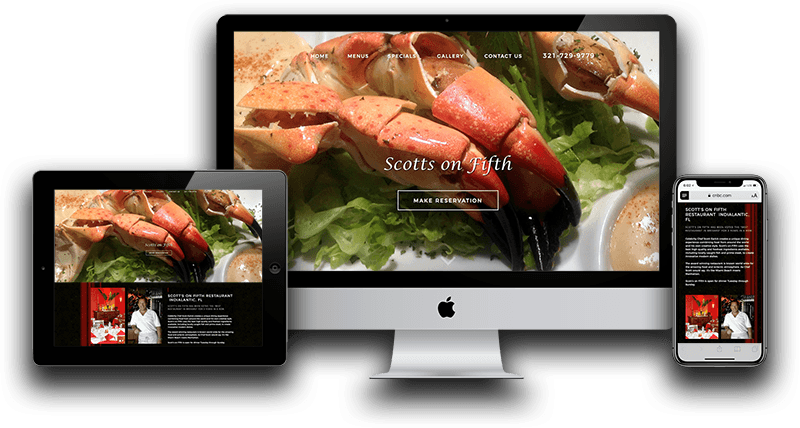
Websites should look great and function flawlessly on all types of devices, browsers, and operating systems. Clients often ask, ” What is responsive web design?” Simply put, a responsive website has a layout that changes with the size of the browser or viewport. The most common types of responsive elements are navigation, images, and containers. The page layout will adapt or “respond” to the size of the viewport. An example of this would be having a page with multiple columns that display on large screens, such as a desktop or laptop, but display only a single column on a mobile device. This is easy to illustrate on tablets such as the iPad, which automatically adjusts orientation from portrait to landscape by simply tilting the device. These columns are an example of responsive containers. On large displays, containers appear side by side. However, when the viewport is smaller, the containers appear one above the other. Other elements, such as font size, spacing, margins, and padding, also adjust to give the user a better experience.
Modern Design
In the 20-plus years that I’ve been developing websites, design trends and technologies have changed numerous times. It’s important to keep your website current. Updating your website is essentially the same as remodeling your storefront or office. Good or bad, it creates an impression. At the very least, your website should get a facelift at least once every 3 years. Depending on your industry, you may want to update your site more often.
There are many new technologies and capabilities introduced every year. Adding functionality is just as important as keeping your website’s appearance up to date. Sometimes, technology updates require websites to be redeveloped on a new platform. Think about it, 10 years ago, very few phones had a QWERTY keyboard. The iPad wasn’t introduced until 2010. Now, with a phone or iPad, users can go shopping, take college courses, and do almost everything we can do on traditional computers.
Mobile-Friendly Designs
Developing a website that is responsive is only part of creating a Mobile-Friendly solution. A mobile-friendly website has additional requirements in addition to having a modified layout. Mobile-friendly sites must load fast. Using compression, optimized images, and minified code are all part of creating a mobile-friendly experience. A correct layout for touchscreen devices is essential. Having touch elements that are too close is the most common mistake made by web designers and front-end developers. Having a website that is mobile-friendly is essential.
AMP Project
AMP or Accelerated Mobile Pages are part of an open source project supported by Google. Created with the intention of delivering fast, smooth, and reliable content across platforms where bandwidth is a concern, such as mobile. Developing AMP content will greatly benefit SEO, especially on mobile devices. There are 3 main components to AMP development. The first is AMP HTML, a slightly modified and limited version of traditional HTML. The second component is AMP JS, a limited library that will work with AMP. The third is AMP Cache. Google AMP Cache serves validated AMP content amazingly fast, which also uses very little bandwidth. My experience is that AMP pages perform much better in both organic searches and paid search results pages, such as Google Ads and Bing.
Quality Content
I’m sure some of you are getting tired of me saying this, but quality content is the single most important component of effective web design. I’ve had clients come to me with mobile versions of their sites that had about half of the information as they had on their regular website. I understand that you don’t want to overwhelm your viewers, but this is a bad idea. There are exceptions, but for most websites, you want to have the same content available on both versions. If you have extra information just to fluff up your website, remove it from both versions and replace it with relevant content.
Videos
Websites containing video are becoming more and more popular. Explainer videos are generally responsive by design and only need to have controls added and configured. Since video backgrounds play automatically, they do not work well with mobile devices or touchscreen devices. It is important to use JavaScript to detect compatibility. The script will determine whether to play the video or replace it with an image.
Scalable Images
Responsive images are an essential part of responsive web design. While most images are scalable, some images work better than others depending on the application. I use mostly .png files and some .svg images. Making them responsive is a simple matter of adding a few lines of code. Be sure to include “alt” and “title” tags with all of your images. You can also use an image as a background in CSS if you want to avoid parsing the image tag.
User-Friendly Features
Anything that gives website users a better experience is a good thing. Most users appreciate features like good navigation or content that flows well and doesn’t confuse new users. Today’s users also take advantage of features that make sharing content simple. These and other user-friendly features must be tailored to work well on different devices.
If you would like more information about responsive web development or would like us to take your website to the next level. Please contact us, and we will be glad to help.