TL;DR: Web design mistakes can cause you to lose customers and hurt your business. The top 10 most common mistakes are:
- Not mobile-friendly
- Slow load times
- Improper page structure
- Lack of a clear call-to-action (CTA)
- Page errors
- Ignoring Accessibility
- Poor Navigation Structure
- Poor Readability
- Cluttered Layout
- Poor or Inadequate Content

Web Design Mistakes
Web sites should be clear, concise, and provide exactly what the user is looking for. Bad web design or a website that is full of errors can turn customers away. With website builders like Wix and WordPress, anyone can build a website. Having a well-performing website is another issue. Avoiding the most common web design mistakes can help you get the most out of your website.
1: Not Mobile-Friendly
Your site should work on all modern devices. A mobile-friendly site is responsive and consistently usable across all devices. This means that navigation is clear and easy to use. Text and links are readable. Images must scale to fit the user’s phone or tablet. Things to look for when developing a mobile-friendly website with good UX design.
- Responsive layout
- Scalable images
- Readable text
- Usable forms
- Clickable elements
2: Slow Load Times
Slow page load times can cause users to leave and even get you penalized by Google. Make sure your pages load quickly. Content should not shift as images and other elements are loaded. There are numerous potential causes of slow page loading. Image size, image type, coding issues, server issues, and overall design can all cause slow page loading. Reducing image size and removing unnecessary scripts will help. Other tools, such as caching and a CDN, can also help. We can analyze your site and let you know if there is a speed issue and, if so, exactly what is causing it.
3: Improper Page Structure
Your site needs to be readable by LLMs like OpenAI (ChatGPT), Gemini, Meta, xAI, and Anthropic (Claude). They also need to be readable by search engines like Google and Bing. Proper page structure is essential. It helps these different technologies and tools determine the relevance of your content.
Proper page structure includes headers, subheaders, lists, and paragraph text. Having a proper structure allows them to organize your content into meaningful data that they are more likely to use. Another essential element of page structure is schema. Having schema will help identify critical data on your site. You must make sure your site is formatted correctly. Without proper structure, you will not get the most out of your content.
- Header structure
- Properly formed text content
- Sufficient text and information
- Schema
- Good content-to-code ratio
- Page title that matches your content
- Meta tags
4: Lack of Clear Call-to-Action (CTA)
Your CTA or Call-to-Action is your goal for users on your page. Things like “Buy Now”, “Get Started”, “Sign Up”, or “Contact Us” are all examples of a CTA.
We had a client with a poorly designed website who sold insurance. Their page on jewelry insurance had a good search rank in Google and a good click-through rate. But they rarely received any inquiries. The problem was that there was no CTA, and users were not clear on what to do next. By adding a link to “Apply Now” above the fold (near the top) and a “Learn More” link at the bottom of the page, the number of inquiries increased by over 3000%.
5: Page Errors
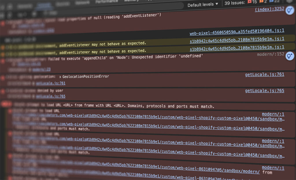
Just because a page looks okay doesn’t mean it’s working okay. Many errors go unnoticed and cause problems for users. Even if everything was working great, a software or security update on the server could cause problems. Scripts and code included from third parties are also common causes of site errors. Errors can cause index issues on Google or cause search issues with AI/LLM’s. Your website should be checked for errors on a regular basis.
6: Ignoring Accessibility
Some users will not be able to use your site properly because of a disability.
Make sure your website meets WCAG standards. If your site does not meet the standards, you could be penalized and not appear in search results. Here are some of the important areas to consider.
- Lack of alt tags on images. Alt tags provide alternative text so visually impaired users can understand the information portrayed by the image. This applies to all images, illustrations, and charts.
- No captions on videos. Adding captions to videos allows the hearing-impaired to understand what is being communicated in a video. When using a screen reader, it can also help someone who is both hearing and visually impaired.
- Inaccessible forms. People with certain disabilities may not be able to understand or fill our online forms. Make sure the form’s instructions are clearly stated. Make sure all form fields have labels such as “Name”, “Address” or “Credit Card Number”. And make sure any errors are clearly readable.
7: Poor Navigation Structure
Users need to find what they are looking for without getting lost. To solve this, make sure your navigation structure allows users to find what they are after in just 2-3 clicks. Make sure navigation is organized so that different categories are not grouped together. When your navigation confuses your user, they are more likely to leave your site before finding what they were looking for.
8: Poor Readability
Text is hard to read due to small fonts, bad contrast, or long blocks of text.
Be sure to use adequate font sizes. The recommendation is 16px. The font type also needs to be considered. Custom fonts may need to be larger to have proper contrast. Make sure fonts are structured to be scalable. This way, people who have their devices set to “large fonts” will be able to read your content.
Contrast is also important. A site with low contrast will be difficult to read for people who have issues with their vision. Black text on a white background will have a contrast ratio of 21:1. The minimum contrast ratio on a web page should be about 7:1. Anything lower than 4.5:1 could cause your site to be penalized.
Long blocks of text should be avoided. Get your point across with as few words as possible. Break long paragraphs into smaller ones with concise key points clearly stated.
9: Cluttered Layout
Too many visible elements compete for attention, overwhelming users. Make sure there is plenty of whitespace on the page. Elements need separation and clarity. Be sure to have room between clickable elements. There should be one visible element at a time that grabs the user’s attention. In our experience, the fewer distractions on a page, the more likely users are to focus on your content.
10: Poor or Inadequate Content
Content is King! You need to have quality content that clearly conveys your message. Each page needs to focus on a single topic and have some value. Quality graphics, images, and videos should be included. When we started building websites, a 5-page site was impressive. Today, most websites have dozens or hundreds of pages. LLMs look for quality content from reputable entities.
- Web page content
- Blog posts
- Images and graphics
- Videos – Published on your site, YouTube, and social media.
We can create quality content to help get your business noticed. If you would like to work with us or see what we can do for you, please contact us.